
 Repository
Current collected state Current
Observed since 20 Oct, 22:01 UTC
No superseded metadata states collected. Unchanged observations do not create new revisions.
@0610studio/expo-skia-date-wheel-picker
Skia-powered date wheel picker for Expo and React Native
Responsive date and time wheel picker for Expo and React Native, with Skia-rendered overlays and immediate onDateChange updates while the wheel moves.
This package keeps the API small and predictable:
date: Date valuedate and time modesminimumDate / maximumDateminuteInterval
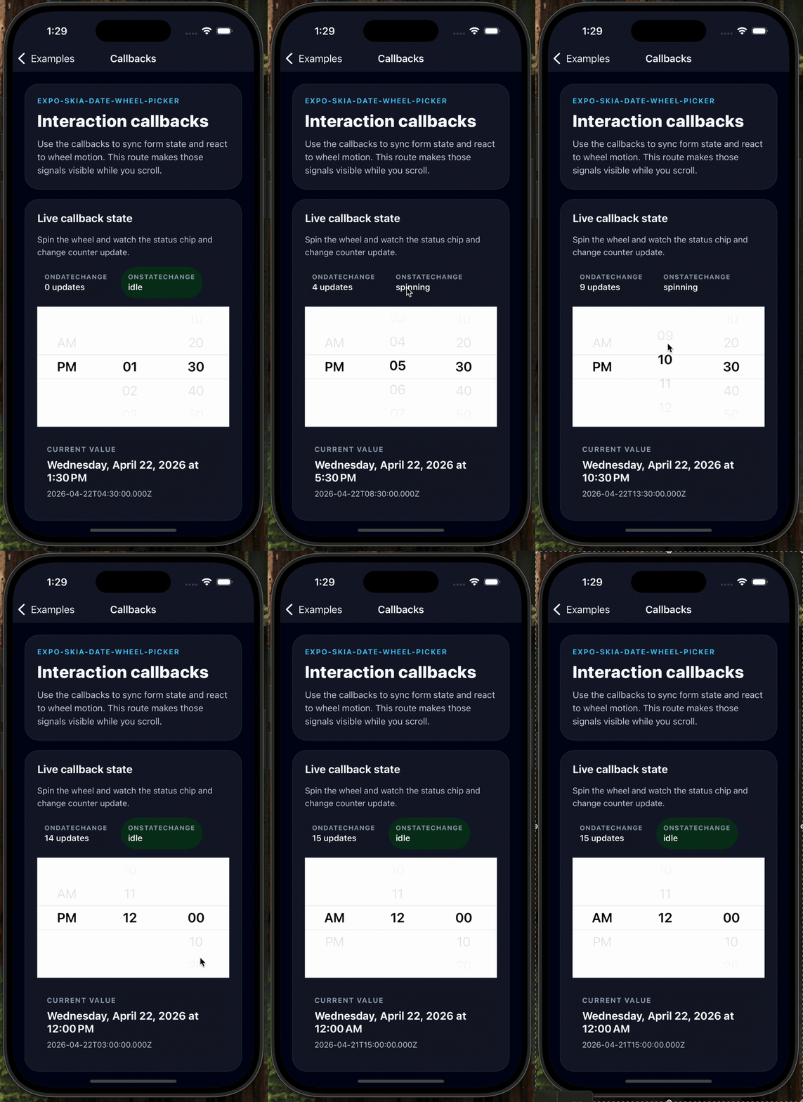
Live callbacks while scrolling Shows onDateChange updating immediately while the wheel moves, together with onStateChange feedback.
|
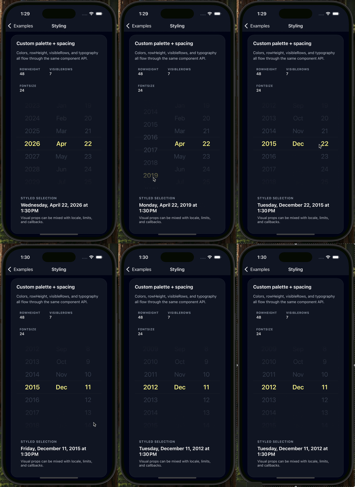
Styling and layout customization Shows custom colors, typography, row height, and visible row count in a dark themed configuration. |
expo-skia-date-wheel-picker is built for cases where a wheel picker should feel responsive and easy to style without introducing a large API surface.
onDateChange fires as the centered row changes, not only after the wheel becomes idle.value / defaultValue split; the picker is driven by date and onDateChange.Note: Skia is used for the wheel overlay and guide rendering. The selectable rows themselves are rendered with React Native views and text.
year / month / dayhour / minute, plus AM/PM when 12-hour time is activeonDateChange callback during interactiononStateChange callback with 'spinning' | 'idle'minimumDate / maximumDate clampingminuteInterval support for stepped time selectiontimeZoneOffsetInMinutes for editing in another timezoneInstall the published package and required peer dependencies:
npm install @0610studio/expo-skia-date-wheel-picker
npx expo install @shopify/react-native-skia expo-haptics
If you are not using Expo CLI for dependency resolution, make sure @shopify/react-native-skia matches your Expo SDK or React Native setup.
import { useState } from 'react';
import DateWheelPicker from '@0610studio/expo-skia-date-wheel-picker';

export default function Example() {
  const [date, setDate] = useState(new Date('2026-04-22T13:30:00'));

  return (
    <DateWheelPicker
      date={date}
      mode="date"
      onDateChange={setDate}
    />
  );
}
You can also import the named export:
import { DateWheelPicker } from '@0610studio/expo-skia-date-wheel-picker';
The package root also exports its public types, including DatePickerProps, PickerMode, DatePartKey, TimePartKey, PickerOption, PickerColumn, WheelColumnProps, and HexColor.
import { useState } from 'react';
import DateWheelPicker from '@0610studio/expo-skia-date-wheel-picker';

export default function TimeExample() {
  const [date, setDate] = useState(new Date('2026-04-22T13:37:00'));

  return (
    <DateWheelPicker
      date={date}
      mode="time"
      minuteInterval={5}
      onDateChange={setDate}
    />
  );
}
import { useState } from 'react';
import DateWheelPicker from '@0610studio/expo-skia-date-wheel-picker';

const minimumDate = new Date('2026-04-10T00:00:00');
const maximumDate = new Date('2026-05-05T23:59:00');

export default function RangeExample() {
  const [date, setDate] = useState(new Date('2026-04-22T13:30:00'));

  return (
    <DateWheelPicker
      date={date}
      mode="date"
      minimumDate={minimumDate}
      maximumDate={maximumDate}
      onDateChange={setDate}
    />
  );
}
import { useState } from 'react';
import DateWheelPicker from '@0610studio/expo-skia-date-wheel-picker';

export default function LocaleExample() {
  const [date, setDate] = useState(new Date('2026-04-22T13:30:00Z'));

  return (
    <DateWheelPicker
      date={date}
      mode="time"
      locale="ko-KR"
      timeZoneOffsetInMinutes={540}
      onDateChange={setDate}
    />
  );
}
import { useState } from 'react';
import DateWheelPicker from '@0610studio/expo-skia-date-wheel-picker';

export default function CallbackExample() {
  const [date, setDate] = useState(new Date('2026-04-22T13:30:00'));
  const [state, setState] = useState<'spinning' | 'idle'>('idle');

  return (
    <DateWheelPicker
      date={date}
      mode="time"
      minuteInterval={10}
      onDateChange={setDate}
      onStateChange={setState}
    />
  );
}
| Prop | Type | Description |
|---|---|---|
date | Date | Controlled selected value. |
mode | 'date' | 'time' | Picker mode. Defaults to 'date'. |
onDateChange | (date: Date) => void | Called when the selection changes. Fires while scrolling as the centered row changes. |
minimumDate | Date | Lower bound for selectable values. |
maximumDate | Date | Upper bound for selectable values. |
minuteInterval | 1 | 2 | 3 | 4 | 5 | 6 | 10 | 12 | 15 | 20 | 30 | Minute step used in time mode. |
locale | string | Locale used for labels and hour-cycle formatting. |
is24hourSource | 'locale' | 'device' | Whether 12/24-hour behavior follows the locale or device setting. Defaults to 'locale'. |
timeZoneOffsetInMinutes | number | Edits the value using a specific timezone offset. |
onStateChange | ('spinning' | 'idle') => void | Reports wheel interaction state. |
backgroundColor | `#${string}` | Wheel background color. Also affects the Skia fade overlays. |
activeFontColor | `#${string}` | Active row text color and center guide tint. |
disableFontColor | string | Inactive row text color. |
allowFontScaling | boolean | Enables React Native text scaling. Defaults to false. |
fontSize | number | Text size for wheel rows. Defaults to 22. |
fontFamily | string | Optional font family for wheel rows. |
rowHeight | number | Height of each wheel row. Defaults to 40. |
visibleRows | number | Number of visible rows. Even values are normalized to an odd count. Defaults to 5. |
date and update it from onDateChange.onDateChange is designed for live synchronization, so form state can update immediately while the wheel moves.minimumDate and maximumDate clamp both the incoming value and the available wheel options.minuteInterval rounds to the nearest valid minute step.timeZoneOffsetInMinutes changes the editable clock representation without changing the overall API shape.visibleRows is normalized so the active row stays centered.rowHeight <= 0 falls back to the internal default.This repository includes an Expo example app in example/. It uses expo-router, so each scenario has its own route.
The example app intentionally aliases the local source as expo-skia-date-wheel-picker for repo development. When you install from npm in a real app, import from @0610studio/expo-skia-date-wheel-picker as shown above.
/ — overview and route index/date — minimal controlled date mode/time — time mode with minuteInterval/limits — minimumDate / maximumDate/locale-timezone — locale-aware formatting and timezone offset handling/styling — colors, row height, visible rows, and typography/callbacks — live onDateChange updates and onStateChangecd example
npm install
npm run start
MIT
Download counts and popularity will appear here as the collector receives them.
| Package / target | Requirement | Relationship |
|---|---|---|
expoEnvironment{
"local_name": "expo",
"alias": false,
"peer_metadata": null
} | ^55.0.16 | development |
jestEnvironment{
"local_name": "jest",
"alias": false,
"peer_metadata": null
} | ^29.7.0 | development |
reactEnvironment{
"local_name": "react",
"alias": false,
"peer_metadata": null
} | 19.1.1 | development |
eslintEnvironment{
"local_name": "eslint",
"alias": false,
"peer_metadata": null
} | ^9.24.0 | development |
prettierEnvironment{
"local_name": "prettier",
"alias": false,
"peer_metadata": null
} | ^3.0.0 | development |
@babel/coreEnvironment{
"local_name": "@babel/core",
"alias": false,
"peer_metadata": null
} | ^7.24.0 | development |
@types/reactEnvironment{
"local_name": "@types/react",
"alias": false,
"peer_metadata": null
} | ~19.1.1 | development |
expo-hapticsEnvironment{
"local_name": "expo-haptics",
"alias": false,
"peer_metadata": null
} | ~15.0.7 | development |
react-nativeEnvironment{
"local_name": "react-native",
"alias": false,
"peer_metadata": null
} | 0.82.1 | development |
expo-module-scriptsEnvironment{
"local_name": "expo-module-scripts",
"alias": false,
"peer_metadata": null
} | ^55.0.2 | development |
react-test-rendererEnvironment{
"local_name": "react-test-renderer",
"alias": false,
"peer_metadata": null
} | 19.1.1 | development |
@shopify/react-native-skiaEnvironment{
"local_name": "@shopify/react-native-skia",
"alias": false,
"peer_metadata": null
} | 2.2.12 | development |
expoEnvironment{
"local_name": "expo",
"alias": false,
"peer_metadata": {
"optional": false
}
} | * | peer |
reactEnvironment{
"local_name": "react",
"alias": false,
"peer_metadata": {
"optional": false
}
} | * | peer |
expo-hapticsEnvironment{
"local_name": "expo-haptics",
"alias": false,
"peer_metadata": {
"optional": false
}
} | * | peer |
react-nativeEnvironment{
"local_name": "react-native",
"alias": false,
"peer_metadata": {
"optional": false
}
} | * | peer |
@shopify/react-native-skiaEnvironment{
"local_name": "@shopify/react-native-skia",
"alias": false,
"peer_metadata": {
"optional": false
}
} | >=2.2.12 | peer |
Source distribution
{
  "shasum": "bee08e4fff6e5844c79e3d62c0f68946a3a0213d",
  "tarball": "https://registry.npmjs.org/@0610studio/expo-skia-date-wheel-picker/-/expo-skia-date-wheel-picker-0.1.0.tgz",
  "fileCount": 33,
  "integrity": "sha512-+OwyALV35UfB4yaigNpl7PlmipeeoasfCM848nsRL2iv8ykLHUWFtV2hjSgxTOc8SzadnzzqXTii3uVM9gqo2g==",
  "signatures": [
    {
      "sig": "MEQCIGApxNXCCn+KK9M1HJ4cn+bjz9+puitLfquLjNQzGwBCAiBmtSN1nZ4gB0UGYqhBh3vkigxypU4upo6+7pbBZBxZ0g==",
      "keyid": "SHA256:DhQ8wR5APBvFHLF/+Tc+AYvPOdTpcIDqOhxsBHRwC7U"
    }
  ],
  "unpackedSize": 3005127
}Shared repository data · GitHub
Observed since 20 Oct, 22:01 UTC
No superseded metadata states collected. Unchanged observations do not create new revisions.
package_version:6834e8edc9b2c609d0ef67902ff9cd3785b63a89efd1a9314afbe9d91e1345bd